 Comparison of two music websites!
At first I wanted to compare Macklemore and Justin Bieber's websites but I noticed that they are to similar, they are barely any differences between these two. On the left side I posted two screen grabs of how the two homepages for eah artist looks like.
 I have decided to compare Macklemore's and Birdy's website.
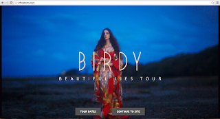
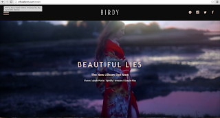
This is the homepage of Birdy's main page.


At first, Birdy's homepage have the name of the artist, however Macklemore doesn't have any text on his main picture. Additionally there is a picture of Birdy on the main page in comparison to Macklemore who has embeded music video. Straight away we can see that Macklemore is breaking the conventions of websites - he is not enhancing that the website is his, which suggests that he is more organic artist.
Also there are logos of each of the artist recognisable for the audience.
Additionally both of the artists have embeded links to their social media sites.

From Birdy's website it seems like she creates really calm music more like indie, alternative music, however Macklemore's visual presentation is implying that his music is 'dark' also from the pictures we can asume that he is working with a lot of people creating like a family that works for success. In my opinion both of the artists are more organic.


No comments:
Post a Comment