Research into music campaigns websites
I decided to do my research on websites using the same artists that I used for album cover research to make the study more in depth.
Flume
The home page of Flume's website is a bit contrasting with the style that he used on the album covers. The design is quite light, everything is in similar colour scheme. The website is pretty straight forward - at the homepage it has the most important information about the concerts, recent album and shop. Flume used a moving image at the background, which I think sets a good feelings, it's calming - it encourages the audiences to take time and look at it.
I enjoy the design that Flume is using in their website. It is simple, easy to direct and pleasurable for the eye. We would like our website to follow that theme, however we would like to use more disturbing picture as a background, which catches the attention of the audiences and makes the website more dynamic and intriguing.
Moby
This is the home page of Moby's website. By using this type of design, which is really simple, Moby is trying to convey that he is an organic artist. The website is neat and clear to follow. There is no information that is unnecessary. It contains whatever is needed to get to know the artist.
Also I think the website design fits the style of his albums, which helps the audiences to understand the type of artist he is.
I like Moby's layout of the website however, I would like to have more design and some sort of fine art in the website of my artist. I think Moby's website is a bit to plain.
A - Trak
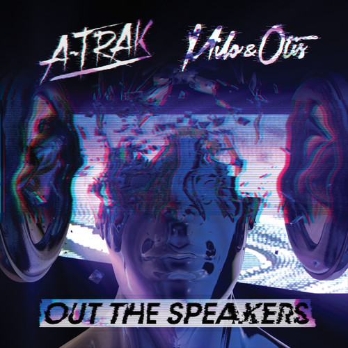
A-Trak has quite interesting design of his website. The first site that comes up is a 'menu' for his official site, to his music or to his shop. His official site is has a moving covers of his albums in the background however it also has a re-direct menu to the tour, newsletter and merch.
His website is much more complex than Flume's or Moby's. It contains repeated information and a lot of re - links. I like that fact that its is kept in one colour scheme in comparison to his album covers and that the design is quite modern and futuristic in some way, which is a possible pathway for our music campaign.
The Lumineers
The Lumineers has a similar layout of their website to A - Trak. The first site is the advertisement of their recent song and its video however in the right corner is a button that re - directs you to the actual homepage. In comparison to their album covers the website has a lot of information in it - moving background, recent news and videos. There is a lot of things happening in the same place however they also have a 'menu' for the tour, fun club and music. They do not have a general theme that runs through the whole website, which I do not like - I think there are to many patterns and designs that they are using, it is easy to get confused in the layout of the information.
While thinking about our website, we established that we want to avoid unnecessary information and multiple themes - we are aiming for something completely different that The Lumineers website.


