Research into digipacks
We started thinking about music campaign (CD digipack and website) for our artist. At the beginning we brainstormed different concepts that we want to include in our digipack. However I did some research on music campaigns of other artists from the same genre of music, which is electronic/ house.
Flume
The first artist that came to my mind was Flume, personally I really like the appearance of album covers and website.


The simple design fits the concept that we would like to follow.
The artist that we are using is organic therefore we want to keep everything in similar colour scheme and have a image or a pattern as a background.
Flume's music campaign is a style that we would aim for. The album covers are quite alternative, creative and original. There is a lot of digital editing included. What we were discussing in a group was the fact that we would like to have a mix of our work and Photoshop so we don't rely on Photoshop fully, since we want to imply that our artist is organic.
There is not much writing on Flume's album covers, which I think works quite well because it does not drag the attention away from the rest of the appearance however it contains the most important information.
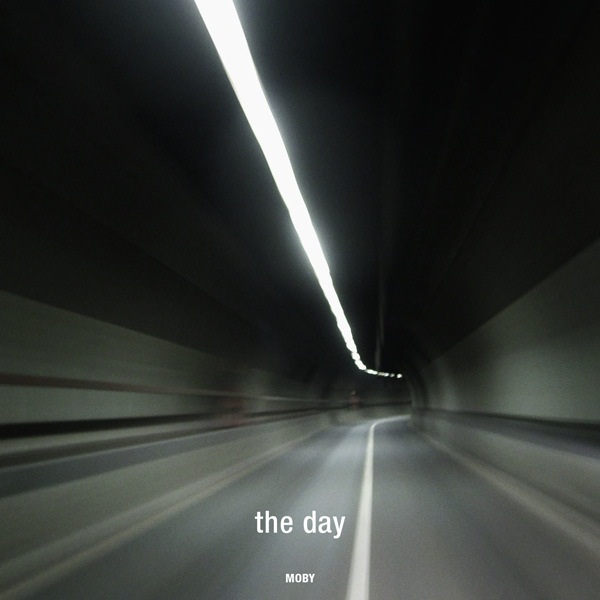
Moby


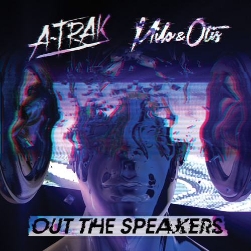
A-Trak

A - Trak is the next artist from the same genre that I found sometime ago. His designs of album covers are a bit more dynamic and complex in comparison to Flume and Moby. However, what I liked in his album covers is some kind of dissolve concept, which adds confusion and distortion to the design. As well as two other artists that I researched, A - Trak only has the name of the artist and the name of the album on the cover however he is using much more vivid and bigger font, which really grabs attentions viewers attention.
The Lumineers
As a last source I choose the band from indie genre. They are one of my favourite bands. They only released two albums by now. The first album contains a photograph, which looks like an old picture with some filters on. I think the picture intrigues audiences and make them question the meaning of the photograph, which I think is a nice technique of using photographs in the album design since they are not revealing a lot. Besides the picture on a black background there is white simple font introducing the artist, which is also the name of the album. This album cover implies that the band is quite organic and quite simple. The next album cover is a bit different since the picture is on a full cover and it is black & white. Additionally it is linked to the name of the album. However it is using similar font.


No comments:
Post a Comment